

Project Production : Individual (2023)
Skills / Softwares used : ADOBE INDESIGN | ADOBE PHOTOSHOP | ADOBE ILLUSTRATOR
Creative Disciplines : BRANDING | ADVERTISING | PRINT DESIGN | PACKAGING | LOGO DESIGN | STATIONERY DESIGN
Project Summary
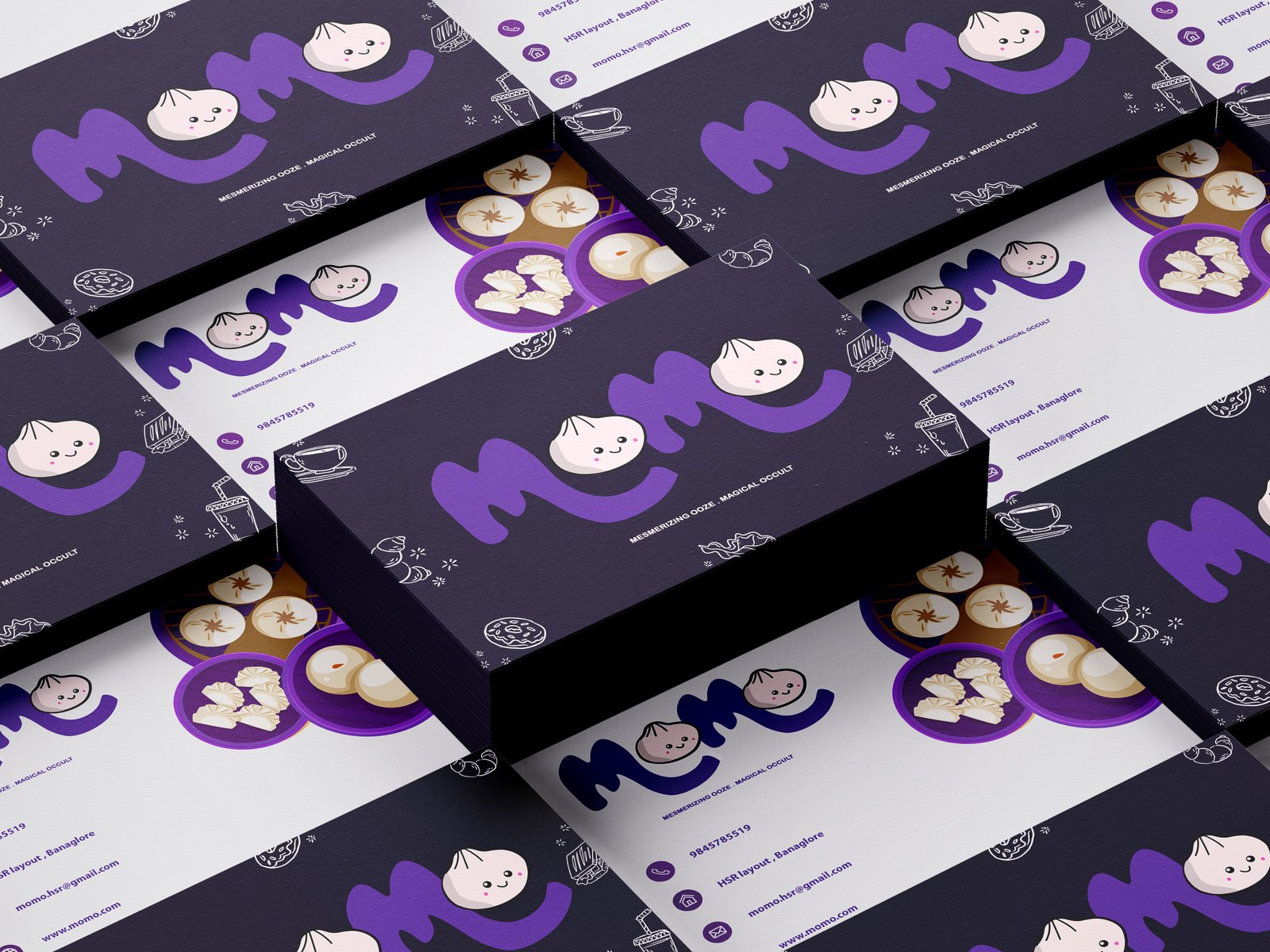
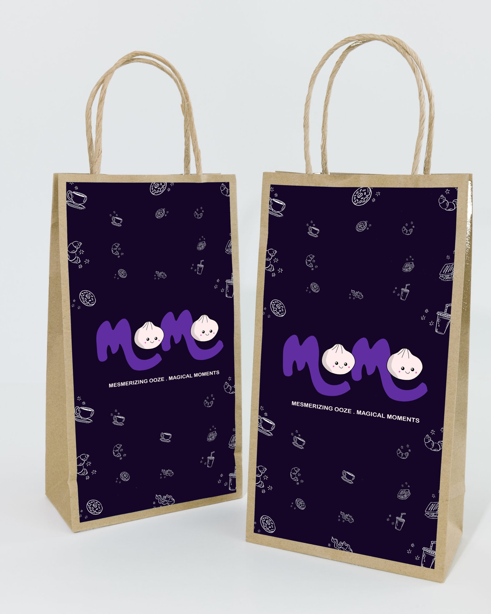
For MOMO’s hypothetical branding, I aimed to blend Japanese minimalism with Indian vibrancy, showing the restaurant’s fusion concept. Beyond the logo, I designed menus, packaging, signage, and digital assets, ensuring a cohesive and inviting identity.
Concept and Inspiration
The concept behind MOMO was rooted in the idea of making street food feel fresh, modern, and exciting. The inspiration came from street food culture, graffiti-style design, and bold, pop-art-inspired typography. Additionally, the branding was designed to evoke nostalgia while remaining fresh and dynamic, appealing to both younger audiences and those who have a deep love for street-style momos.
Challenges, Reflections and Key Takeaways
Working on MOMO allowed me to explore the intersection of food branding and vibrant, street-inspired aesthetics. This project reinforced several key learnings:
- The Power of Playfulness in Branding: Playful branding can be a huge asset when done right, it makes a brand approachable, fun, and highly engaging.
- Functionality Matters Just as Much as Aesthetics: Designing food packaging isn’t just about looks, it’s about usability. Creating a balance between aesthetics and practicality was a valuable lesson.